
Bobcat's 'Project Sparrow'
Year: 2022
Type: Commercial
Role: Lead Designer
Done: Prototyping, UI and UX
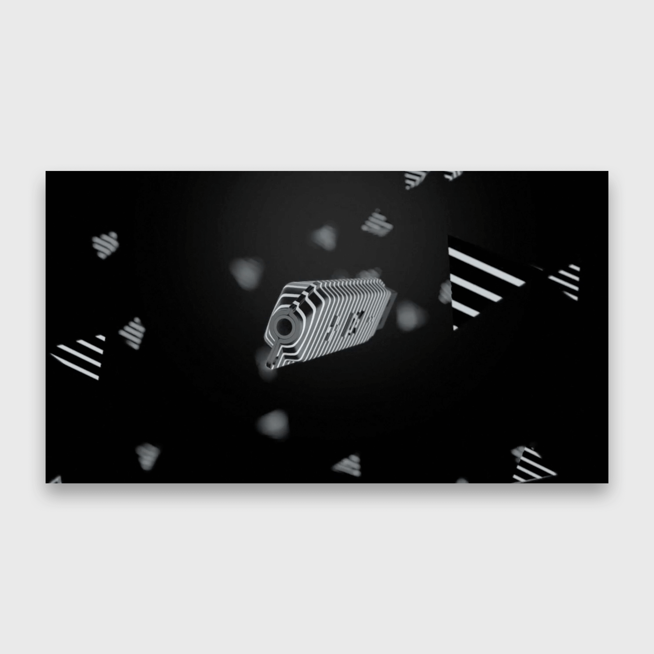
Bobcat, the manufacturer of heavy equipment, was planning on unifying their clusters into one-for-all device. Given this is the building equipment that have very rough operating environment this device was chosen to be button operated only. The best part of this was constrains: machine language, ISO icons only, 6 buttons to operate all and most importantly: no text. This was due to attempt of cutting costs because of required translations for foreign markets.
User testing for most of the steps was organised to check theories whether this concept will ever be feasible.
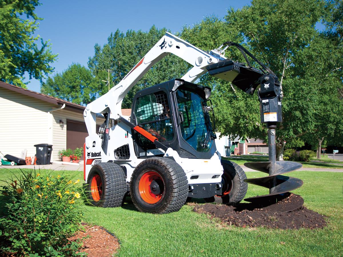
This should be adaptable in the future to be used on other equipment like industrial power generators but this project was based on skid steer loader as default machine:
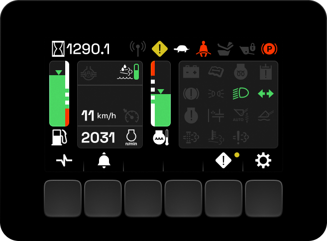
1.Dashboard
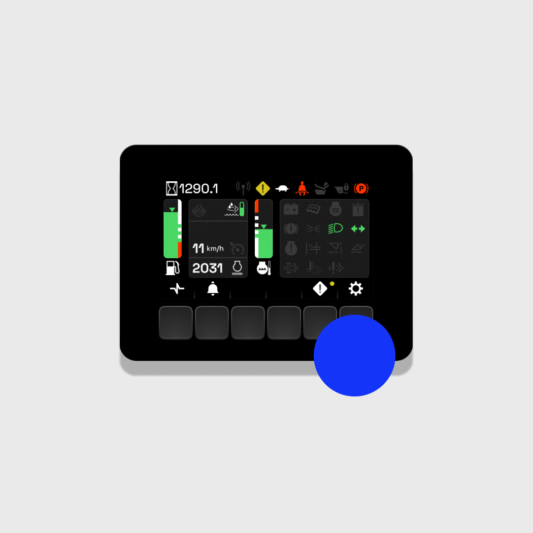
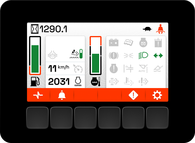
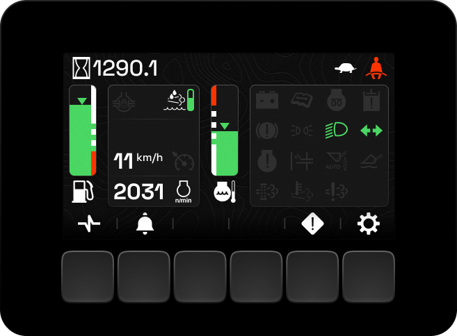
This is default gauges view where equipment operator can watch important real-time information like oil temperature, fuel level and important canbus system states. Top part is system status messsages-icons and engine hours that are always visible on every screen no matter what. Icons have pre-defined set for each equipment type with null state visible to let operator be familiar with their placement so he can be sure that it's not hidden and he can miss something.
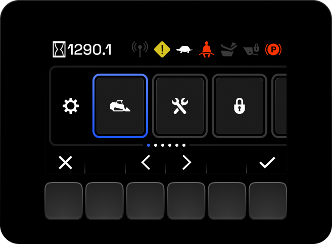
2. Settings Menu
Settings are the horizontal list with highlight selection and confirmation button. It basically consists of ISO icon riddles of what operator can set.
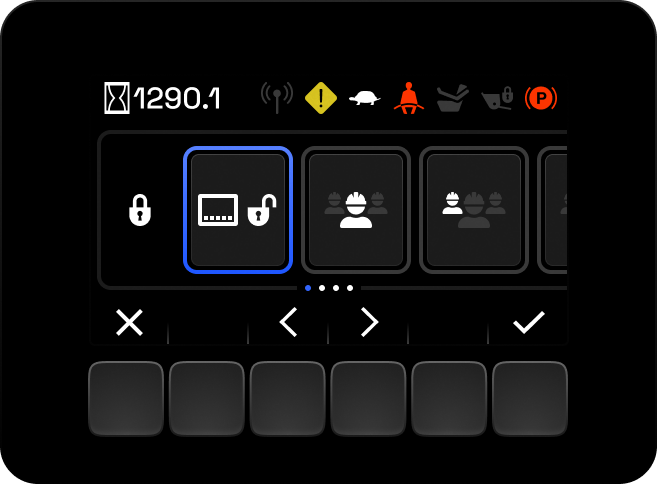
3. Settings / Security Settings
Here is notable how structure works in this system: every list is horizontal with icon of directory being a header. There is no "back button" and there is only one set of navigation language with X to close this level of menu. It was done to limit the similarities between same mental image of left-right arrows and another type of arrow that is placed in another spot. "Is that arrow to jump to the start of the list?"
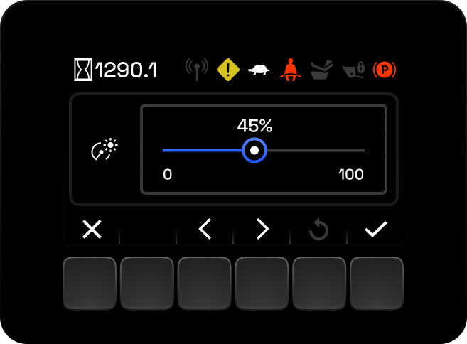
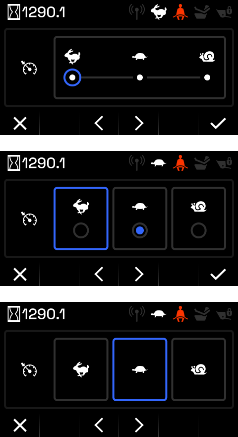
4. Slider
We decided to have a slider with pre-defined 5 steps for speed. Unit doesn't have brightness sensor so sometimes it's important to have some adjustment made quickly.
This control was a part of different set of controls I designed with the function-adjustment matrix with accessibility in mind.
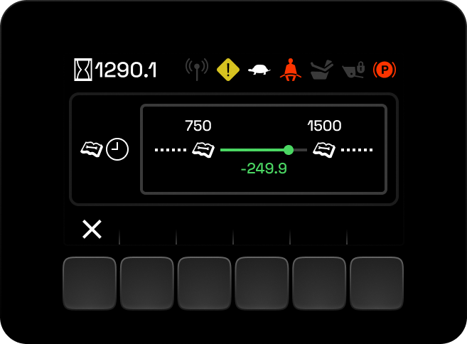
5. Service Interval View
For some cases riddles are basically infographics representing in this example service intervals with remaining hours visible. The confusing format of minus-number was chosen because it is current system language and folks are familiar with it.
6. Testing Interactions
Sliders, radio-buttons, switchers: we had it all. But we chose wisely how to make a specific selection with accessibility in mind and common logic, convenience vs. minimising errors, etc.
7. Skins
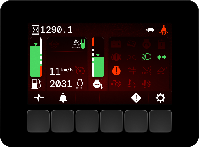
When we figure out the flow and process I made a few variants of how it could look. The final decision was made to balance readability on not-great-screen sprayed with dust on a sunny day. Its was fun process to play with skeuomorphism like in old times.
☟
The rest of my portfolio is below
Thanks for watching ♥︎