⛅︎CloudMade
Year: 2018-2019
Type: Commercial
Role: Designer
Done: UI, Prototypes, User Stories, Interaction Animations, Icons, etc.
In 2017-2019 I was a part of the small design team in a British automotive tech company called CloudMade. I was hired as Interaction Designer to work directly with Design Director on a demo OS firmware for car infotainment as a ‘proof of concept’ and a demo of their current technology capability and portfolio. I was working half time from office, half time from home. It was a great experience. But I discovered one thing — as Interaction Designer I became somewhat opposed to transferring everything into touch screens. I think that if to make it right it should be regulated as much as other part of the car. There should be reasoning behind things, not only aesthetic & marketing.
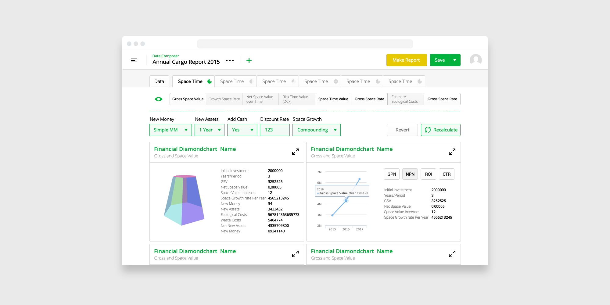
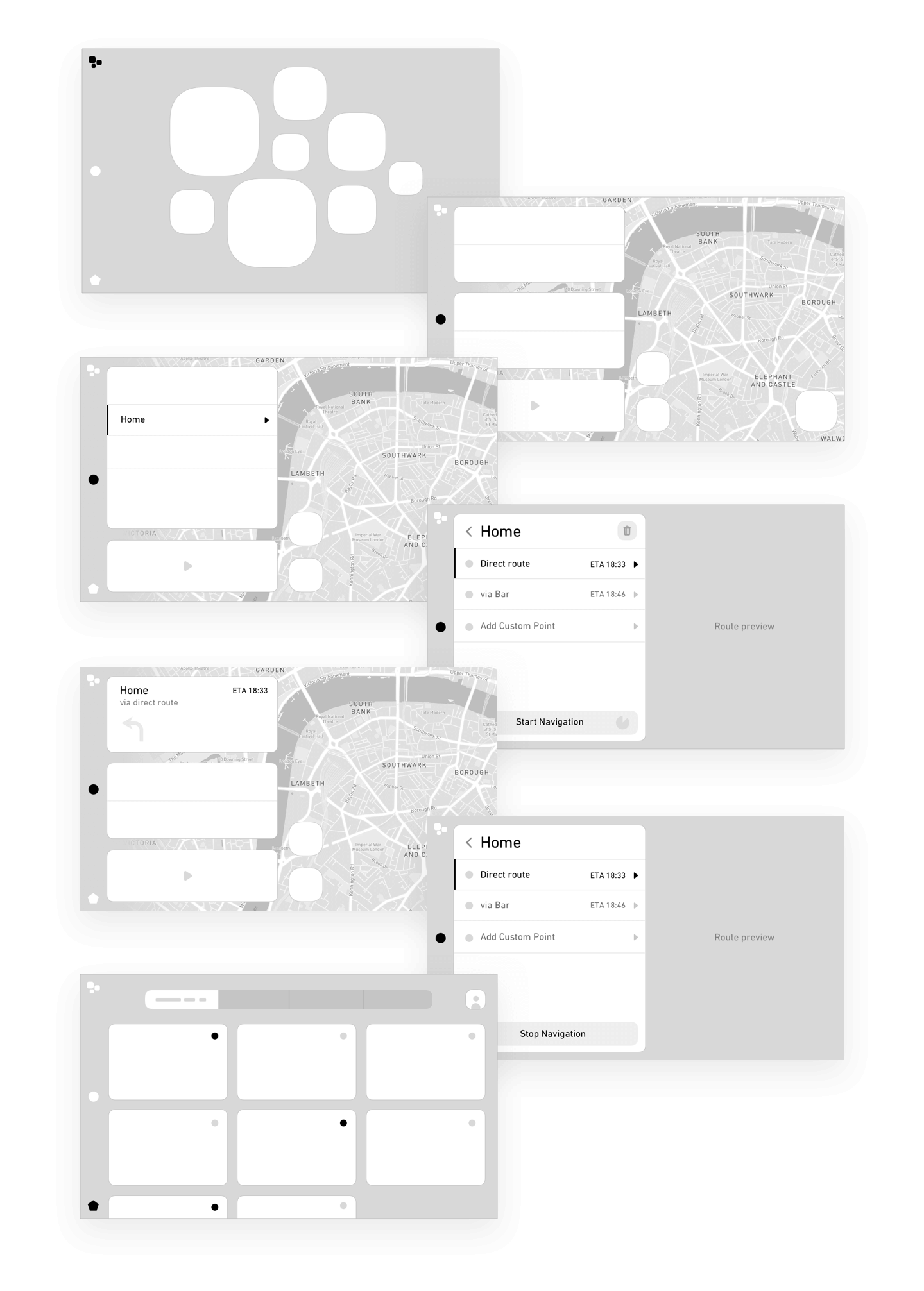
Original Wireframes
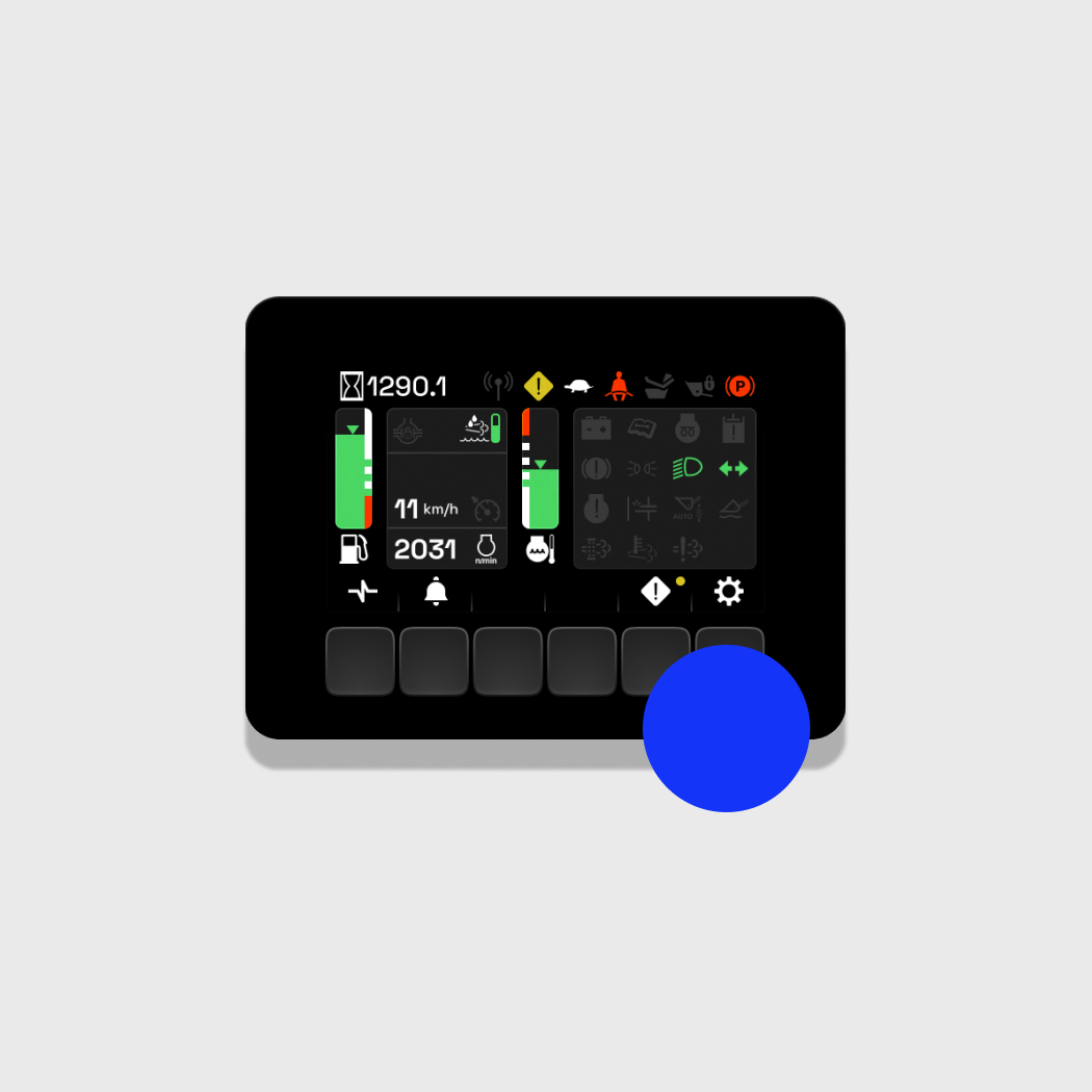
Originally it was my intention to make things very smooth and simple. Funny though I haven't drive yet while I was doing this. And having a touch screen in car for me was not very understandable to say at least. I tripped a lot on instrument cluster because it was the only thing that might be designed useful while being digitalised and I didn't have much competence on how machinery will operate in different road scenarios. But this, this thing made me mad and scared because I understood that its impossible to make it useful and usable on the level that some one might say: "Hey thats better than a physical buttons!". Do I look differently on it now when I have a lot of driving experience? Yes, and I wan't those things even simpler and standardised.
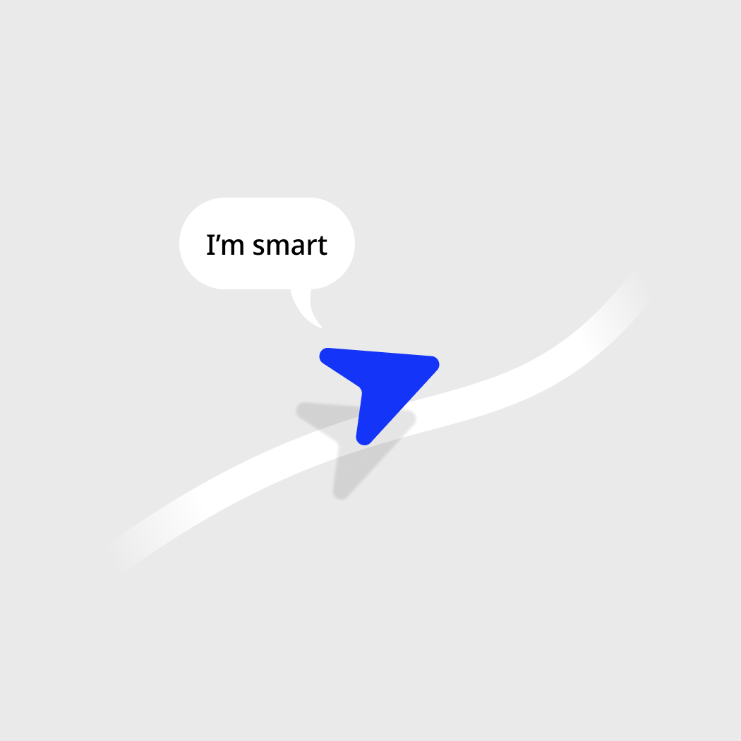
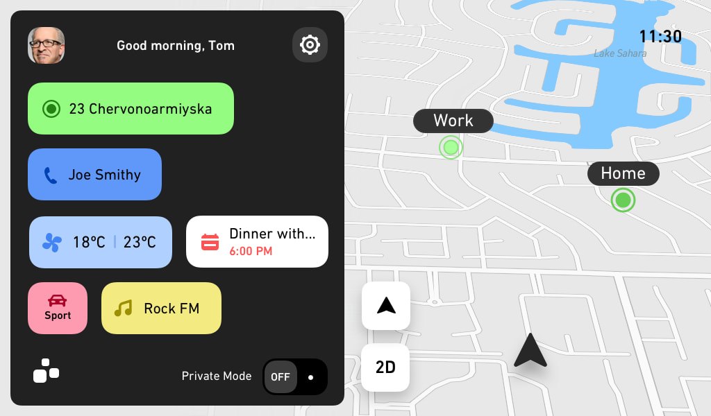
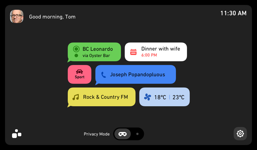
But anyway: the good thing about this concept is ability to guess based on data what is it user wants to do, where to go, what music to listen or what temperature to set. It has this home screen with shortcuts to set or start things. The bigger the tile the more confident the system is. So you kind of just move along with what system suggests keeping your thoughts flowing. This theme with suggestions is used in other parts as well. You open navigation in specific time and place? We have a suggestion of places for you collected from different sources, etc.
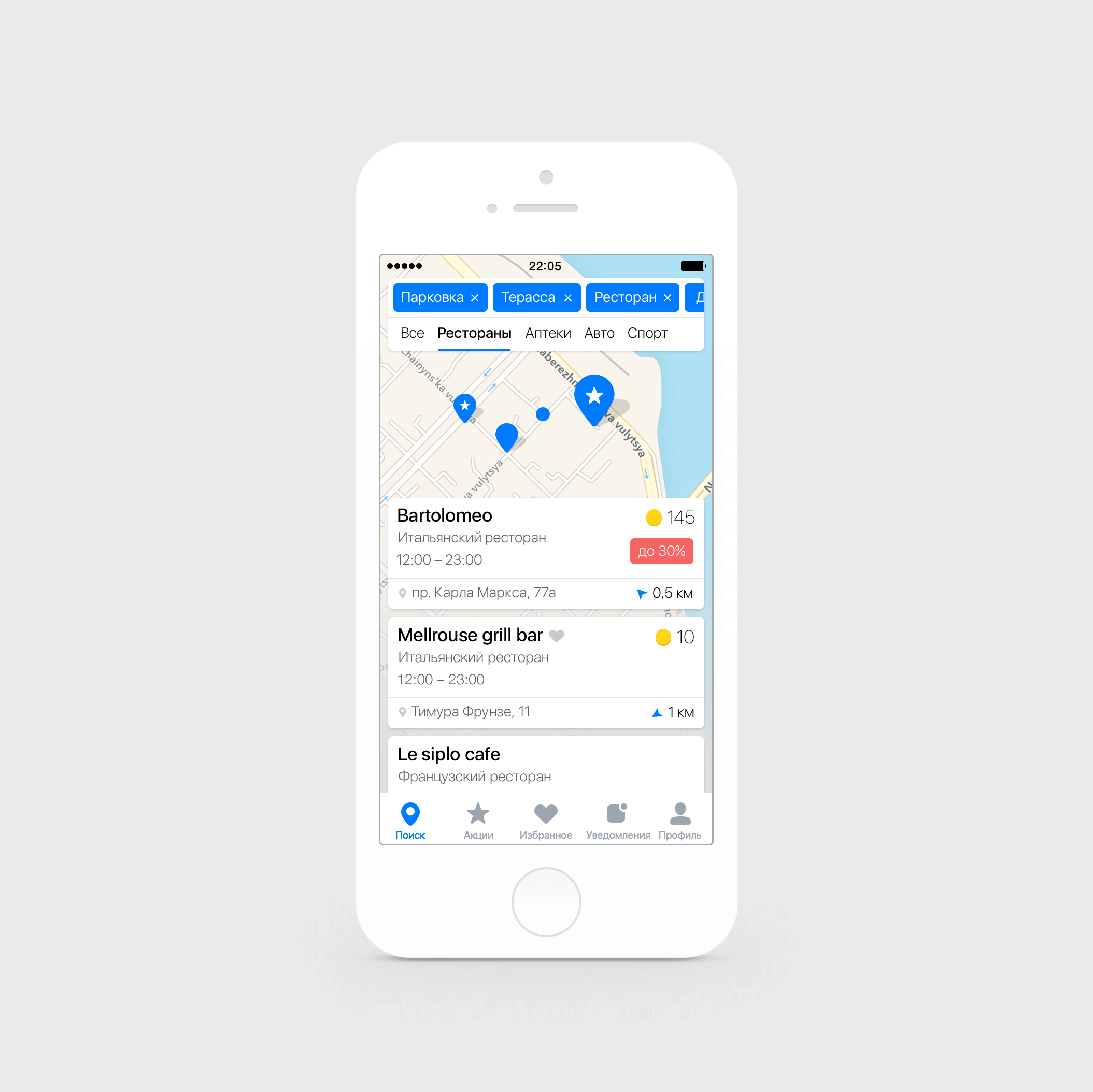
Different UI Variations
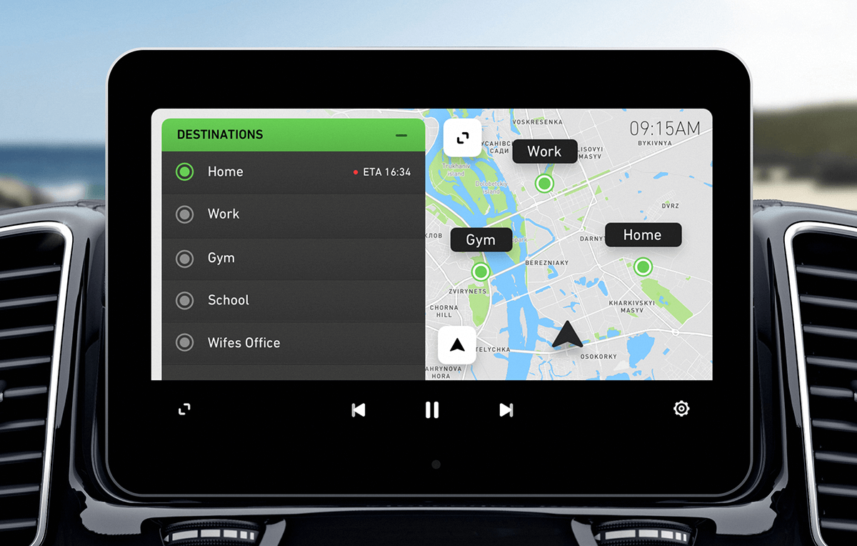
This is a composition of different design approaches we had based on how smart and mininalistic it should be. Plus it was a bit of changes in people who made strategic decisions at time.
While working on this I pushed driving safety oriented approach. Where each decision should be evaluated with different constrains: for example the test car was using the chinese laminated screen and in a sunny day over finger smears all over it was 'impossible' to design anything with gradients or low contrast.
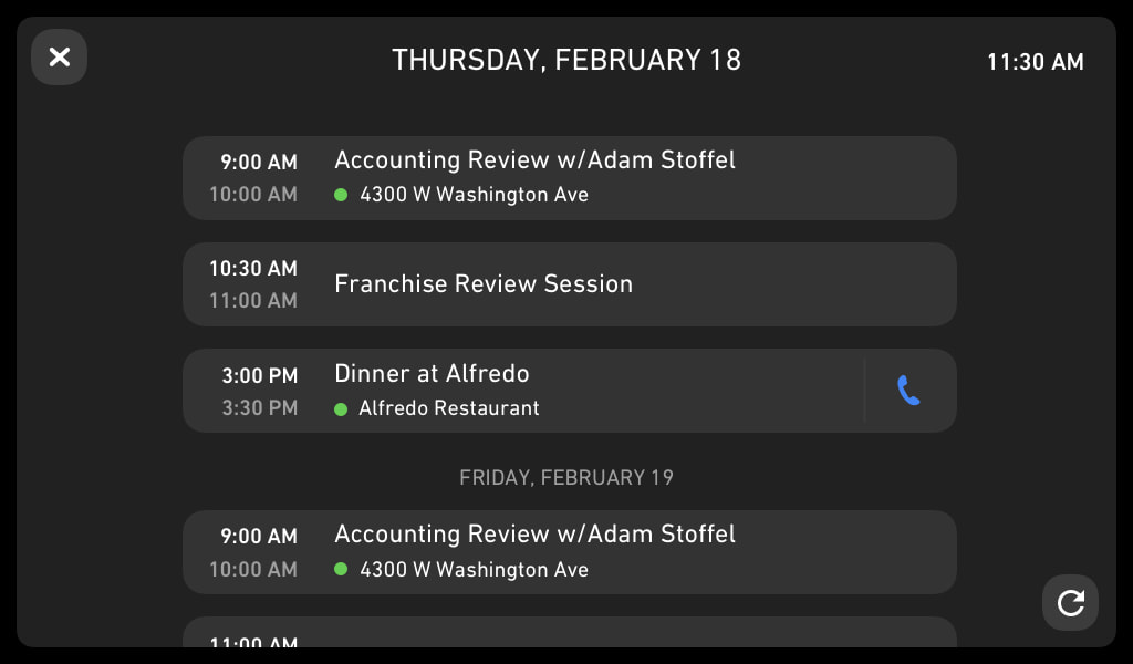
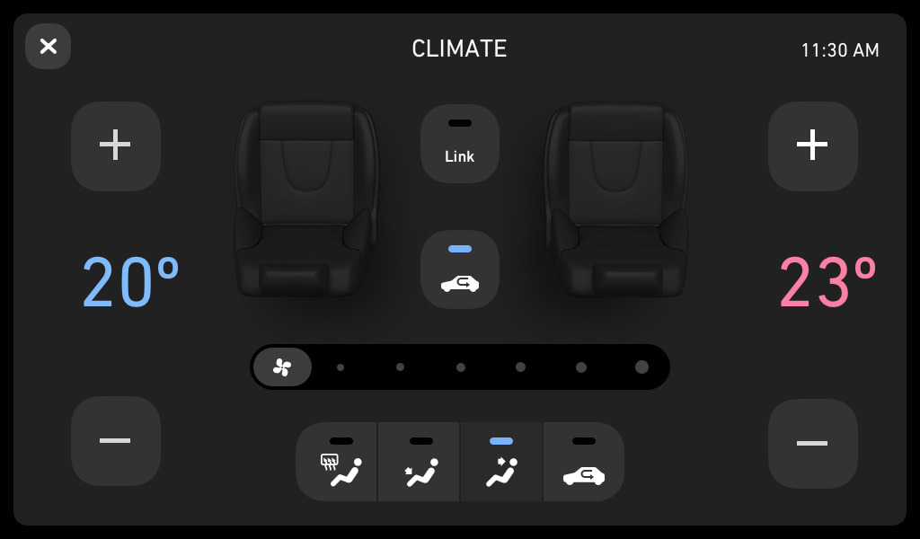
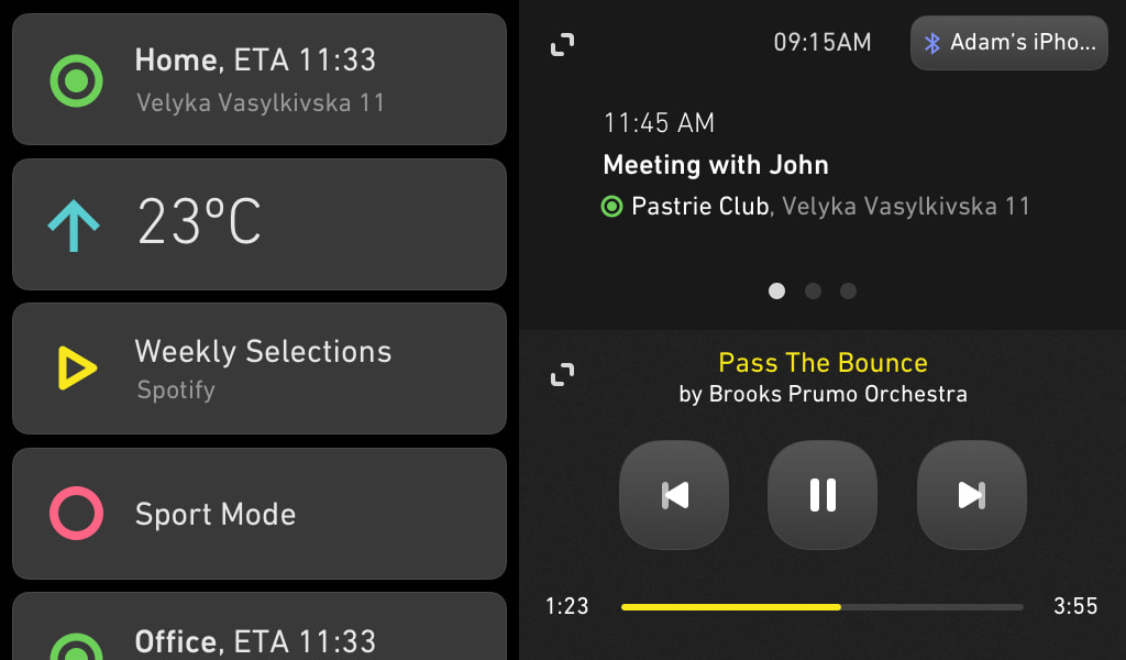
.
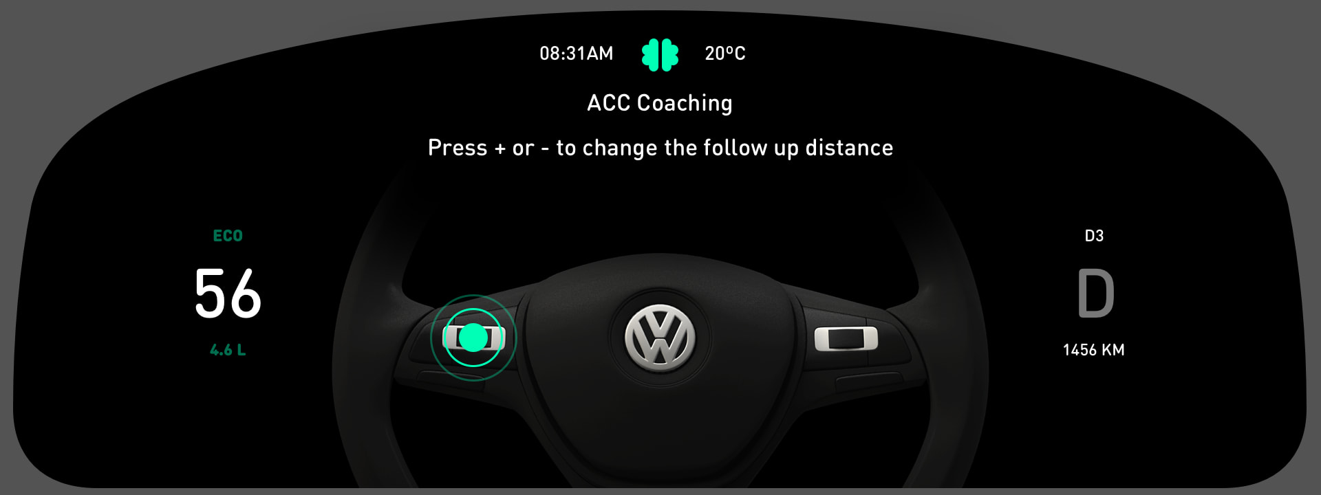
UI Animations
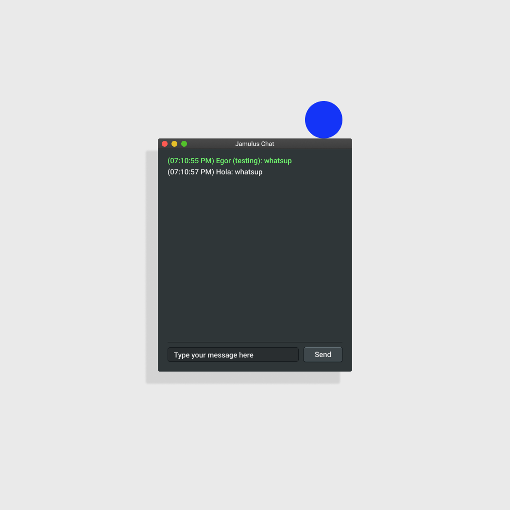
A few videos of After Effects prototype for microinteractions for messaging and Principle prototype for how panels should work.
Final Word
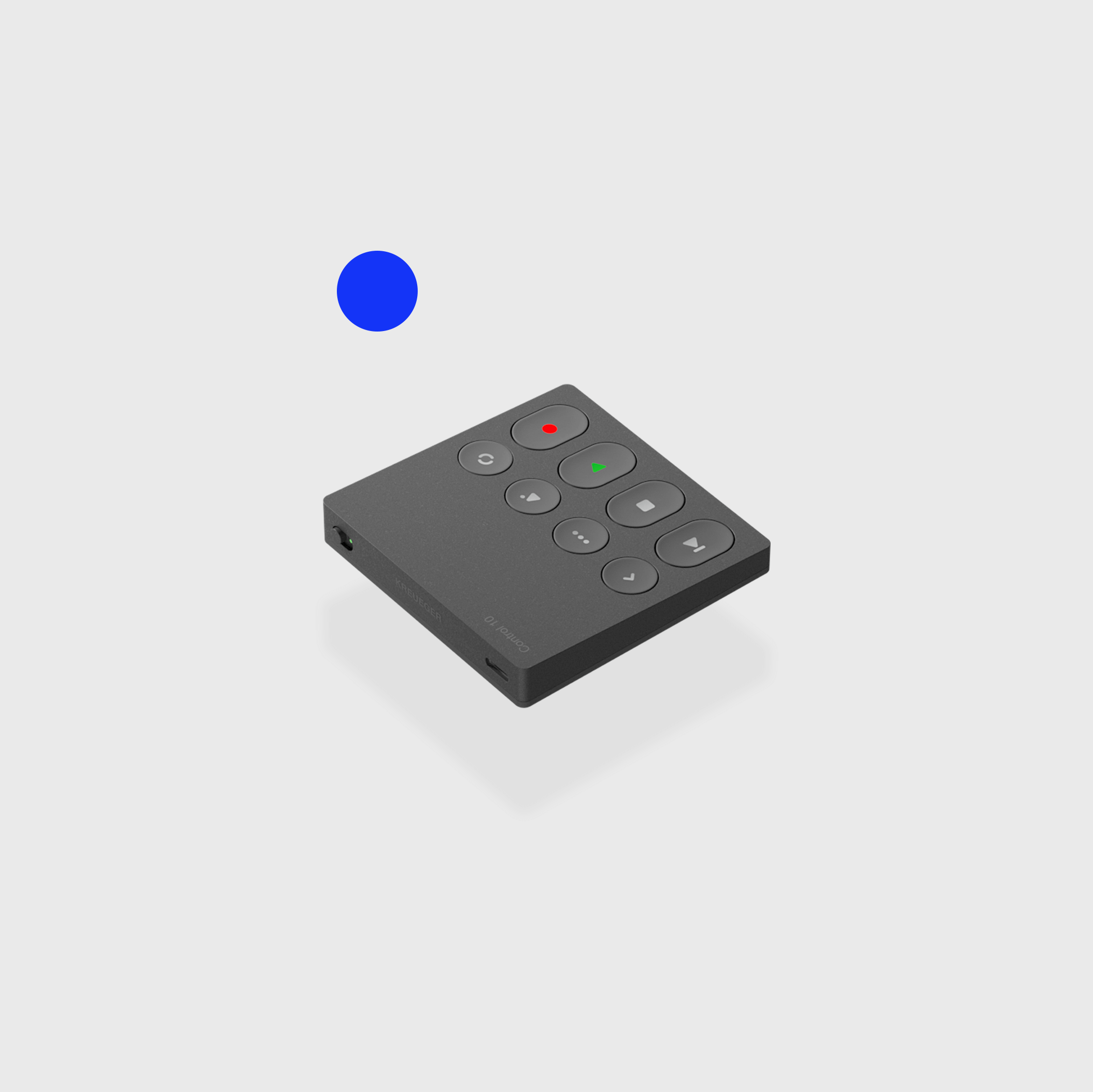
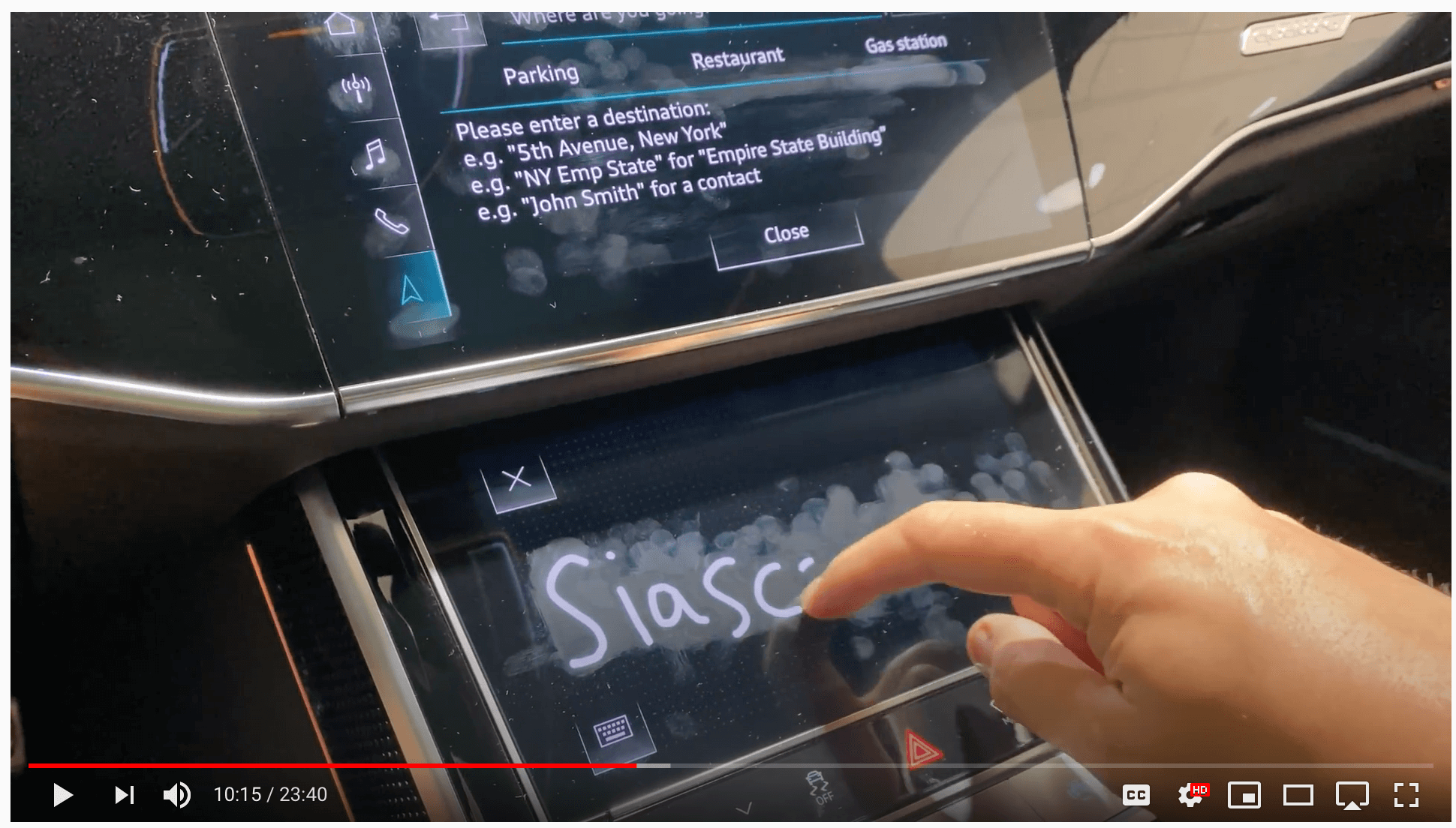
But the thing with everything you seen above is that it is ends up to be presented and interacted with like this. This is a top of the line Audi.
To say that I'm not a fan of this as user and as a designer is an understatement.
☟
The rest of my portfolio is below
Thanks for watching ♥︎